Parallel Practices
Exaggerated Proportions
From Ruhlmann to Kuramata, Bradley to Balenciaga
Art / Design / Fashion

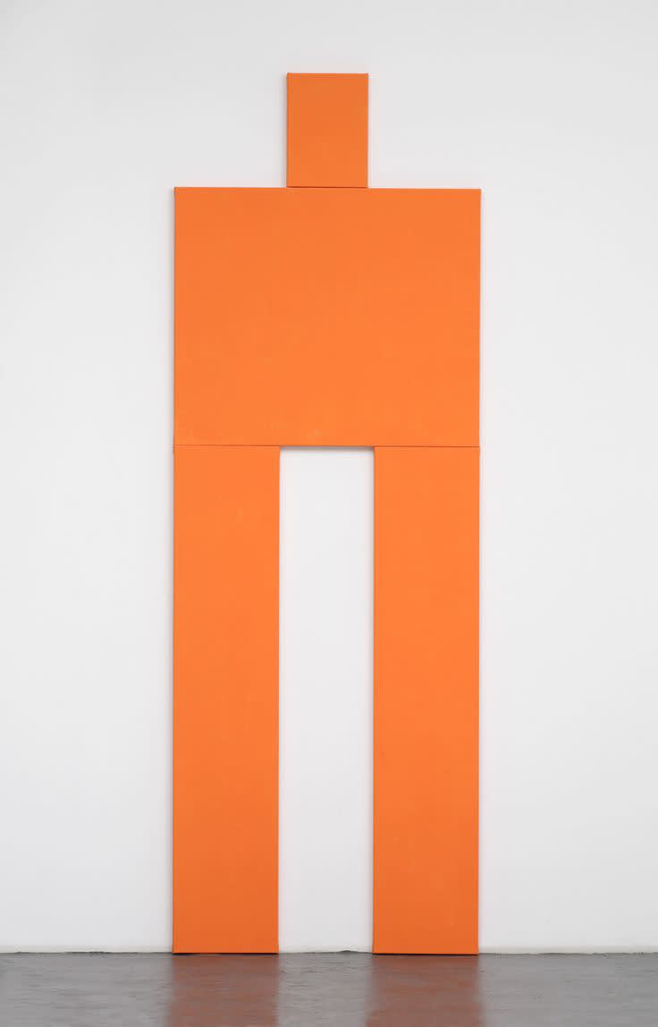
Joe Bradley
The Thing, 2007
Proportion is inherent to design. The incalculable ways in which comparative measurements are meticulously combined to make a whole, generate a unique balance and harmony within construction and form. Exaggerated proportions exist in many capacities whether to magnify or reduce, overemphasize or minimize, or draw attention to specific design objectives. Abnormal proportions are often implemented for a distinct artistic affect.
In the early twentieth century, French furniture designer Émile-Jacques Ruhlmann produced a series of Small Cabinets, the first example dating back to 1916, with a second iteration coming just shortly after in 1919, and a third in 1924. While long, thin, spider-like legs are characteristic of Ruhlmann’s designs, the shrunken cabinets of these works combined with the designer’s artful use of rich materials, such as ebony, gilt wood and ivory, give the Small Cabinet an undeniable sense of delicate extravagance.
Small Cabinet, 1916
Small Cabinet, 1919
Small Cabinet, 1924
This magnification and reduction in furniture design without question imbued the work of Japanese designer Shiro Kuramata decades later when he released his now famous Imperial Cabinet for the first Memphis Group collection in 1981. Kuramata’s tambour-fronted storage unit stands atop long, slender legs, almost identical in proportion to Ruhlmann’s Small Cabinet. Unlike Ruhlmann, however, the Japanese designer was celebrated for his use of understated materials as well as his ability to transform industrial elements into modern design narratives. That same year, Memphis Group co-founder George James Sowden released his D’Antibes Cabinet, similarly proportioned to the works of Ruhlmann and Kuramata, however slightly more energetic in its decorative elements. While Sowden’s contribution focused less on pure proportion and more on the Memphis Group’s Pop Art aesthetic, similarities are nevertheless present in all three cabinet designs.
George James Sowden
D'Antibes Cabinet, 1981
Shiro Kuramata
Imperial Cabinets, 1981
Discussing exaggerated proportions in the context of art, there is no denying the intense visual dialogue of Joe Bradley’s “robot” paintings from 2006-07. Each robot, while varying in color and composition, has a distinct, exaggerated silhouette – long, slender legs, boxy shoulders and a shrunken, almost nonexistent torso.
Joe Bradley
Standing Figure (Robot), 2007
Joe Bradley
Nightrunner with Strike, 2007
Joe Bradley
Simian Run, 2006
Joe Bradley
The Thing, 2007
Joe Bradley
Untitled, 2006
Joe Bradley
Itz, 2007
Taking this palpable visual dialogue and expanding it into the realm of fashion, there is an obvious connection to the spring/summer 2017 men’s and women’s runway collections at Balenciaga. In both cases, creative director Demna Gvasalia emphasized the giraffe-like legs of his waif-thin models in skintight Bermuda shorts and fluorescent high-waisted spandex, counterbalanced by exaggerated, boxy shoulders and shorter-than-normal jackets and peplum blouses.
Exaggerated proportions exist in various capacities across all creative disciplines. Such purposeful design elements as proportion give way to an increasingly rich and vital dialogue between artistic mediums, further synchronizing art, fashion and design across decades.


